Whether you are promoting a new product, testing a new collection, or building the buzz around your brand, designing a pop-up store that leaves a strong impression on your current and potential customers is key. As one of the most important innovations in the last decade, pop-up stores have been used as a promotional tactic to emphasize a specific item and to put your products in front of new customers.
Being about 80% less expensive than traditional brick-and-mortars, many entrepreneurs and digitally native brands use it as a strategy to affordably test the market and their concepts. Without having to make the financial commitment that comes with opening a brick-and-mortar, the popularity of temporary stores is understandable.
Although pop-ups represent approximately $10 billion in sales revenue, due to growing customers’ expectations, they do require a detailed strategy. As the modern shoppers continually hunt for novel experiences they will memorize, retailers should use the one-of-a-kind temporary store as an opportunity to engage their customers in an unparalleled way. Here is an aggregated set of guidelines that can assist you in creating a compelling experience:
The power of multi-sensory experiences
When designing your pop-up, keep in mind that today’s consumers do not simply visit your store to buy an item, but are on the look for a shopping experience. Since the duration of your temporary store can greatly vary, this gives you the freedom to experiment with various themes and try out ideas that would usually not have been achievable in your flagship. For example, tackling all the sensors of your customers is a real challenge, but with a pop-up, developing a multi-sensory experience is finally possible.
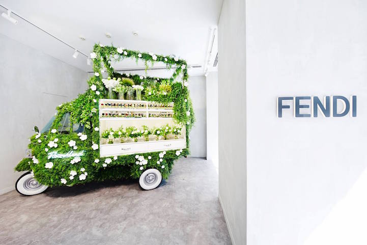
An interesting case that played with sensors is the Fendi pop-up flower shop. To promote their Spring/Summer collection themed around flower power, the Italian luxury fashion house took a unique approach to its promotion. They collaborated with renowned floral artist Azuma Makoto to transform the iconic vintage Piaggio vehicle into a pop-up.
Stocked with two types of limited Fendi bags and Makoto’s original floral arrangements, they used the pop-up as an actual vendor for the floral bouquets, blending experience with convenience.
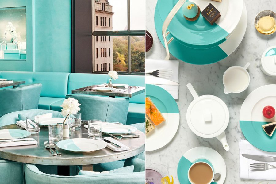
Who said fashion and food can’t go together? Another interesting example of a pop-up is the Blue Box Cafe from Tiffany & Co that launched in London for this Valentine’s Day. Recreating the famous Breakfast at Tiffany’s setting, the luxury retailer allows its visitors to immerse themselves in a world of film, food, and luxury jewels. The concept works on the first-come, first-served basis, giving it a touch of exclusivity.
The limited duration and artificial scarcity visible in these examples greatly reflect the need of the current consumer market for uniqueness, change, and novelty. When designing your temporary store, make sure to include these to attract the modern shoppers.
Layouts that guide your shopper
When devising your pop-up, you want to spark your shopper's curiosity. To make that happen, a floor layout that will naturally guide visitors to walk around and delve into every corner is a prerequisite.
An element that further plays an important role is the decompression zone. The transitional area consisting of the first five to 15 feet between the outside and inside of your pop-up is paramount to whether shoppers will enter your store or not. To encourage visitors to candidly explore the area and make the latter more inviting, many advise leaving the decompression zone open, as items placed there can easily be overlooked. Here are some layouts to consider when designing your floor plan:
The Herringbone If you would like to showcase a high volume of items in a small space, place aisles along the left and right walls of the space. While keeping the middle space open, this will visually prolong your store and allow for smooth exploration.
The Loop The loop layout uses a path that helps guide customers from the entrance, through the store, and back to the beginning. In this way, you can highlight the best products by placing them in the middle area and simultaneously give shoppers a complete overview of your merchandise.
The Free Flow This configuration allows for more creative flexibility and gives shoppers the freedom to walk around at their own pace as there is no set design. Although this format does not strictly follow a specific pattern, you should carefully consider the placement of your premium products.
Unexpected locations that surprise your shoppers
As pop-ups are only temporarily located in a specific area, this gives you more freedom to experiment with your store location. Some argue that the more abrupt the location of your pop-up, the better. Without the need to sign a long-term lease, it allows smaller retailers to explore areas that might not have been available, such as high-fashion or culture districts. Depending on the location of their flagship, many brands often place their pop-up in the nearby area. In this way, if shoppers want to continue exploring further, they can easily do so. In case you are uncertain where to place your pop-up, here are some ideas:
Shopping centers and malls: This location can be very successful due to the quality of its foot traffic. Visitors who are in shopping malls are likely open to purchasing new items, increasing the chances they will check out your store as well. Although renting a location in a shopping center might be more expensive, it can indeed attract a lot of attention.
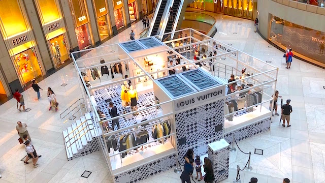
Pop-ins: If you want to showcase your products within a different store, then pop-ins are a good idea. Choosing a store that is complementary with your merchandise, or targets the same audience, is a good idea.
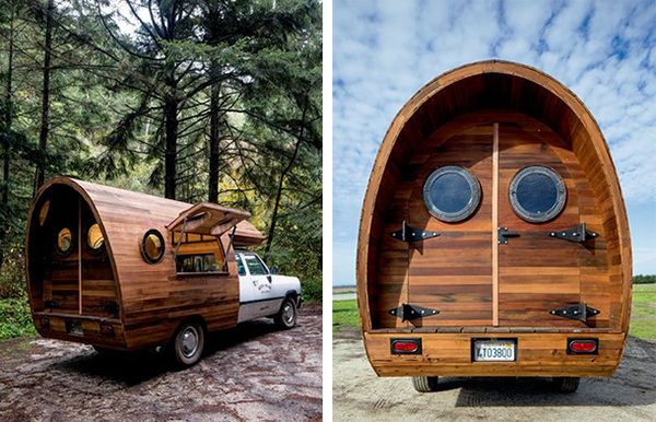
Mobile locations: As in the case of the Fendi flower pop-up, mobile stores can help reach more people and give you the freedom of adjusting your strategy to the surrounding.
Galleries/event spaces/hotels: If these resonate with your brand, galleries, event spaces or hotels can offer a unique artistic experience.
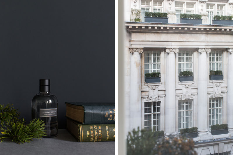
To introduce their new line of high-end shaving products, luxury retail brand Bottega Veneta opened a pop-up barbershop in the London-based Rosewood Hotel. The classically-constructed design of the space, in this case, was ideal for such an occasion. The pop-up included a full shaving service using the brand’s new products, attracting a high-end clientele and creating a lot of buzz.
No matter your choice, always keep in mind that the chosen location should also reach the right target audience. If you look for an environment that is complementary to your brand and eliminates your direct competitors, you better go for it!
Choosing a relevant theme that excites your customers, picking a desirable pop-up design layout, and finding a location with high foot traffic are important elements you should consider when opening your temporary store. Once you’ve covered these, let your imagination go wild and create an experience your shoppers will never forget.
Are you curious to learn more? Through our integrated decision-making platform at StoreDNA, we help you deliver dramatically improved performance through better product assortments, store layouts, visual merchandising, and associate optimization. Learn more here.