Five years ago when we started the StoreDNA (ex-Monolith) journey by placing sensors on digital advertising screens, we were also working hard to optimize the experiences of our customers’ websites. It remains a great proposition, to test ‘architectural’ changes on the website, follow what consumers do, and aim to remove the friction along every step of the purchase path.
Then Microsoft Kinect came along, and we realized what the future holds. By using simple, small, and off-the-shelf cameras, we will be able to do the same in real, physical spaces.
Suddenly, a whole new world has opened. Imagine that we can optimize every space which humans inhabit and use the learnings to create frictionless experiences when we work, shop, and entertain ourselves. However, as it is usual with moonshots, the idea is much easier to envision than deliver. Physical spaces are more complex, as all human senses come into play to deliver an (in)experience.
While we have managed to capture all key elements of visible human behavior (shopping patterns), there are still many un-investigated processes which determine behaviors and remain hidden from plain sight. This is where the psychology of spaces comes into play and enables our deeper understanding of what really drives shoppers to behave in certain ways. Human behavior is largely driven by spaces in which we spend time and the key drivers are just about to be mapped and examined by researches.
In this article we examine the key variables which we can change within the spaces we design, including colors, shapes and size..
Colors
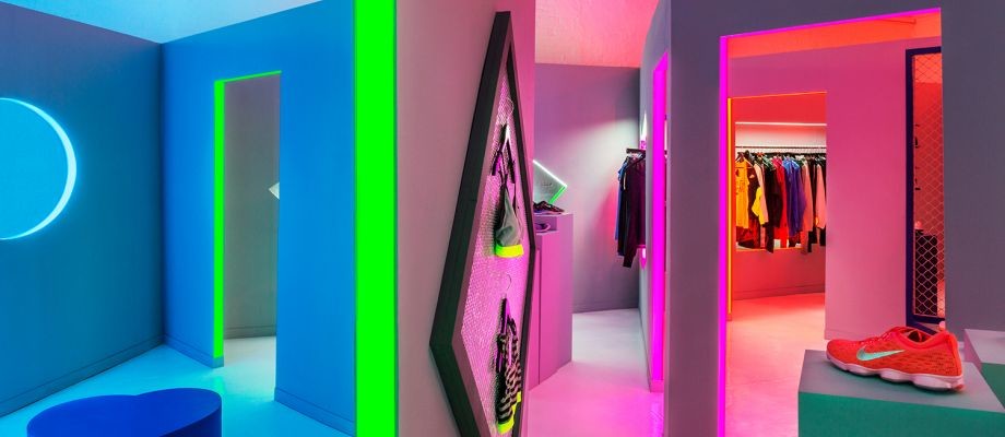
There was an interesting experiment called ‘Blue or Red?’ published in Science Magazine in 2009. The psychologists were researching how the color of interior walls influences the imagination. They recruited six hundred subjects and had them perform different cognitive tests displayed against red, blue, or neutral colored backgrounds.
The differences were revealing. When people took tests in the red environment they were much better at skills that required accuracy and attention to detail. According to the paper, this is because people automatically associate red with danger, which makes them more alert.
The color blue carried a different set of psychological benefits. While people in this group performed worse on short-term memory tasks, they did far better on those requiring imagination. In fact, subjects in the blue environment generated twice as many “creative outputs” as subjects in the red condition. The color of a wall increased our imaginative power twice!
According to scientists, the color blue triggers associations with the sky and sea. We think about expansive horizons and diffuse light, sandy beaches and lazy summer days. This sort of mental relaxation makes it easier for us to daydream and think in terms of tangential associations; we’re less focused on what’s right in front of us and more aware of the possibilities in our imagination.
Taking this into the account, we often smile when seeing store advertising price drops with red signs. This makes us more alert and indicates danger, and could diminish our desire to act on that messaging.
Heights
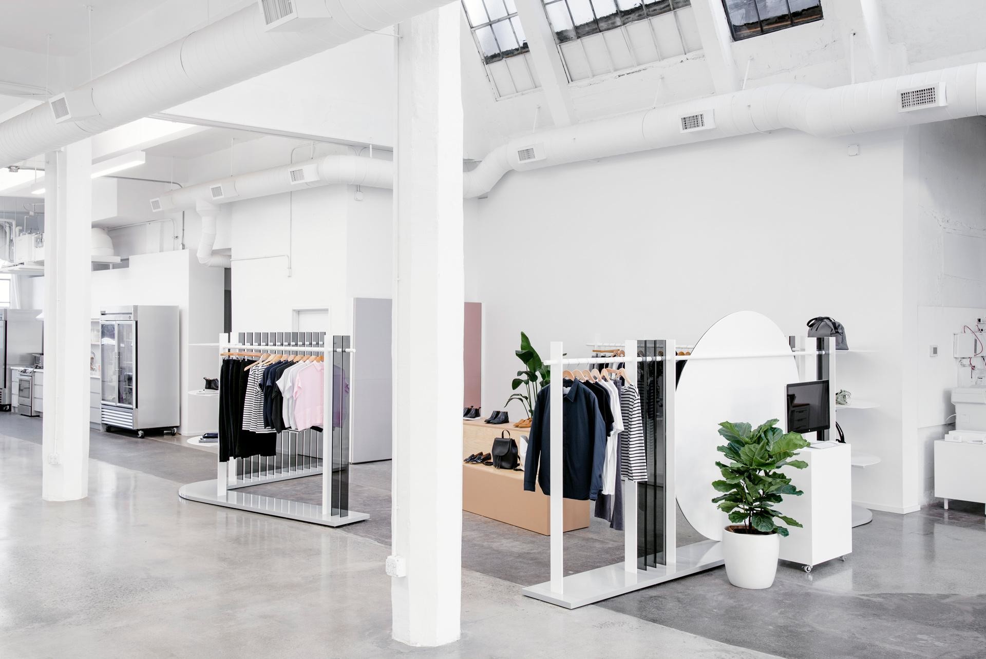
You may have noticed that you feel more free in spaces which have higher ceilings. This article is written in a large Starbucks with a wooden, vaulted ceiling and it probably has an impact on how I feel, including a great flow-through of energy and freedom.
High ceilings are associated with freedom, which in turn makes our thoughts more free. A study by Meyers-Levy and Zhu demonstrated that making ceilings only 2 feet taller (around 0.5m), from 8 to 10 feet, will make people think more abstractly and open-mindedly. In psychological literature this is called relational processing and it means that people think in a way which searches for similarities between objects and connects otherwise disparate ideas. In other words, relational processing drives open-mindedness instead of searching for faults or sticking to preconceptions and pre-set plans. The opposite idea, item-specific processing, means that people pay close attention to details of each specific idea.
In a retail setting, especially in a flagship store within which we want to convey our brand messaging, we want shoppers to think relationally. This is because a shopper thinking relationally will be influenced more strongly by what the products share: the brand and brand-evoked associations. He or she will be more immersed in the brand’s idea and less so on particular products. A shopper thinking relationally will also be more open to learning about our brand message and less likely to stick rigidly to preconceptions.
‘Hugs’ - curved vs. rectilinear furniture
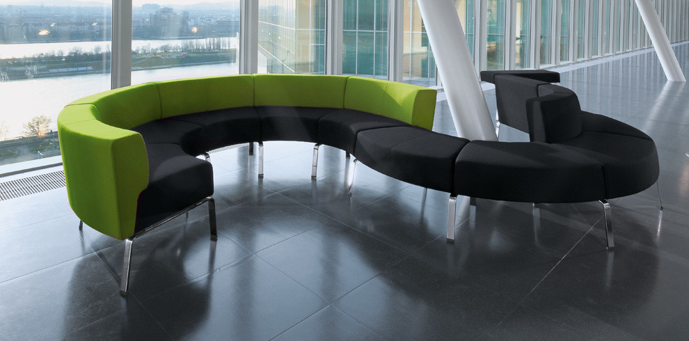
In this study, subjects viewed a series of rooms filled with different kinds of couches and lounge chairs. The results highlighted that furniture defined by straight edges were rated as far less appealing and usable.
Humans are attracted to round and U-shapes, something which invites us like a hug from a good friend. To get shoppers to stop at a shelf, experiment with hanging a circular sign from the ceiling or placing a U-shaped background behind it. These make people want to stop and enter the space, as they are reminded of a person extending their arms for a hug. Also, fixtures which are more curved invite shoppers to engage.
Open spaces and voluminosity
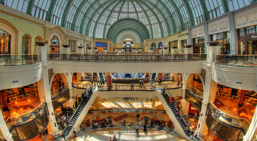
In another interesting study, researchers found that our experience spending time in different types of ‘built’ locations (e.g. open, closed, etc.) is more impactful on our cognition than previously believed. More specifically, the data suggest that properly-built environments can boost our well-being, which in turn help guide our decision-making process.
While this analysis has driven broader discussions including the impact of environment on raising children and the use of neuroscience by architects to impact well-being, we think it is relevant to retail as well. For example, we argue that the study supports the idea that store experience is critical for consumers’ understanding and appreciation of a brand’s messaging. In fact, we don’t see the store experience as a static process for retailers, rather an evolving challenge as customer appreciation will change over time as shoppers revisit the store and enjoy the space with different configurations. Each change in location experience is an opportunity for retailers to drive the positive well-being of its customers, and in turn their decision-making.
Lighting
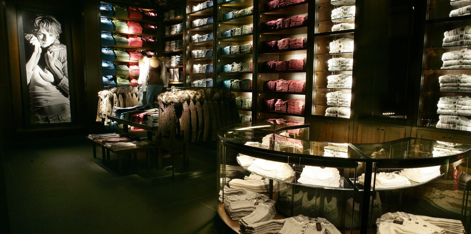
We conclude with an interesting study regarding lighting and its direct impact on the retail store consumer. While the work was academic in nature, we think there are some real-world takeaways nonetheless.
A detailed methodology was established to draw associations between in-store lighting and consumer behavior. The authors note that the process of retail store design has become much more involved over the years, so the analysis was trying to capture that complexity, including that retail-space designers need to rely on psychology, ergonomics, and other specialty disciplines. Primarily, the study concluded the atmosphere of the store (including lighting) had a significant impact on store image, judgements of brands, perceptions of price, dwell time, and inclination to ‘impulse buy’. Second, more specifically for lighting, the authors note research that shows customers are drawn to light, that bright/focused lighting draws more dwell time and touches, and that lighting drives a perception of product attractiveness in the store.