How to design the brick-and-mortar of the future? With so much considerable uncertainty in the air, we are naturally turning to relaxing activities that allow us to miraculously escape from the current reality. Whether it is by socializing with friends, pursuing sports, or buying clothes, we seek for a stress-free, dreamy environment. But what about our shopping experiences?
Today, if you enter Zara, you will routinely find a bunch of shoppers walking around, trying out clothes outside of the fitting rooms, and looking to seize the last discounted fashion piece. The fast beat of the music will force you to walk quicker and grab more, but you are also likely to leave the store fairly quickly, feeling both unsafe and exhausted. The aforementioned scene accurately portrays how not to welcome back your shoppers, as it reflects the prioritization of sales above all. Instead, focusing on developing a relaxed, personalized, safe experience is essential.
Looking at the current state of shoppers, we are witnessing the need for meaningful activities. On that note, we can’t expect shoppers to enter our store simply because they need to buy a shirt. In this specific period, to carefully bring people in-store, we must offer much more than just plain shopping. Now, we are not only talking about placing measures that will make shoppers feel safe - this is a simple prerequisite. We are equally not referring to empathic communication and discounts. What we are respectively referring to here is delivering an experience people are (sub) consciously craving for. Currently, so many of us feel the need to escape, so why wouldn’t retailers transform their brick-and-mortars into areas that will stimulate us to forget our daily struggles? Why wouldn’t we focus on developing an environment that will invite shoppers to relax, dream, reconnect and find their inner balance? Only once these requirements are fulfilled, can we achieve a strong customer relationship, loyalty, and finally - sales.
To inspire you, we have gathered some examples of retailers that are not merely promoting their collections but are providing a brilliant atmosphere and using it as their unique selling point:
Shift the Focus
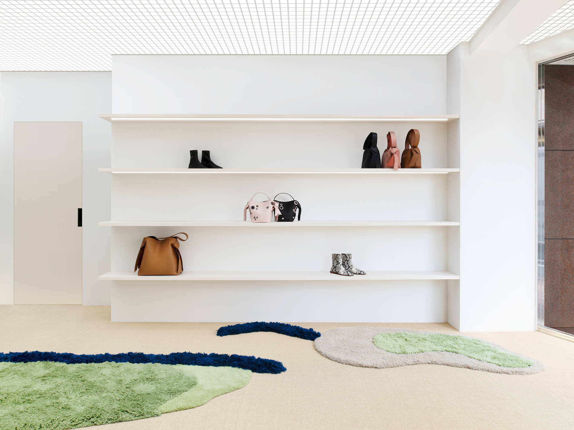
Instead of taking the traditional approach and presenting product collections, Acne Studios carefully designed its project store with emphasis on their product range. The Tokyo-based store, since it opened its doors, has been located in four unique interiors, each highlighting one key product range from the established brand. In this way, they adopted a unique approach to displaying their work, avoiding unnecessary visual stimulations.
This refreshing concept takes into consideration the shopper’s safety and wellbeing, and although developed in 2017, the marvelous model gives a sneak peek into how stores could look like in the ‘new normal’.
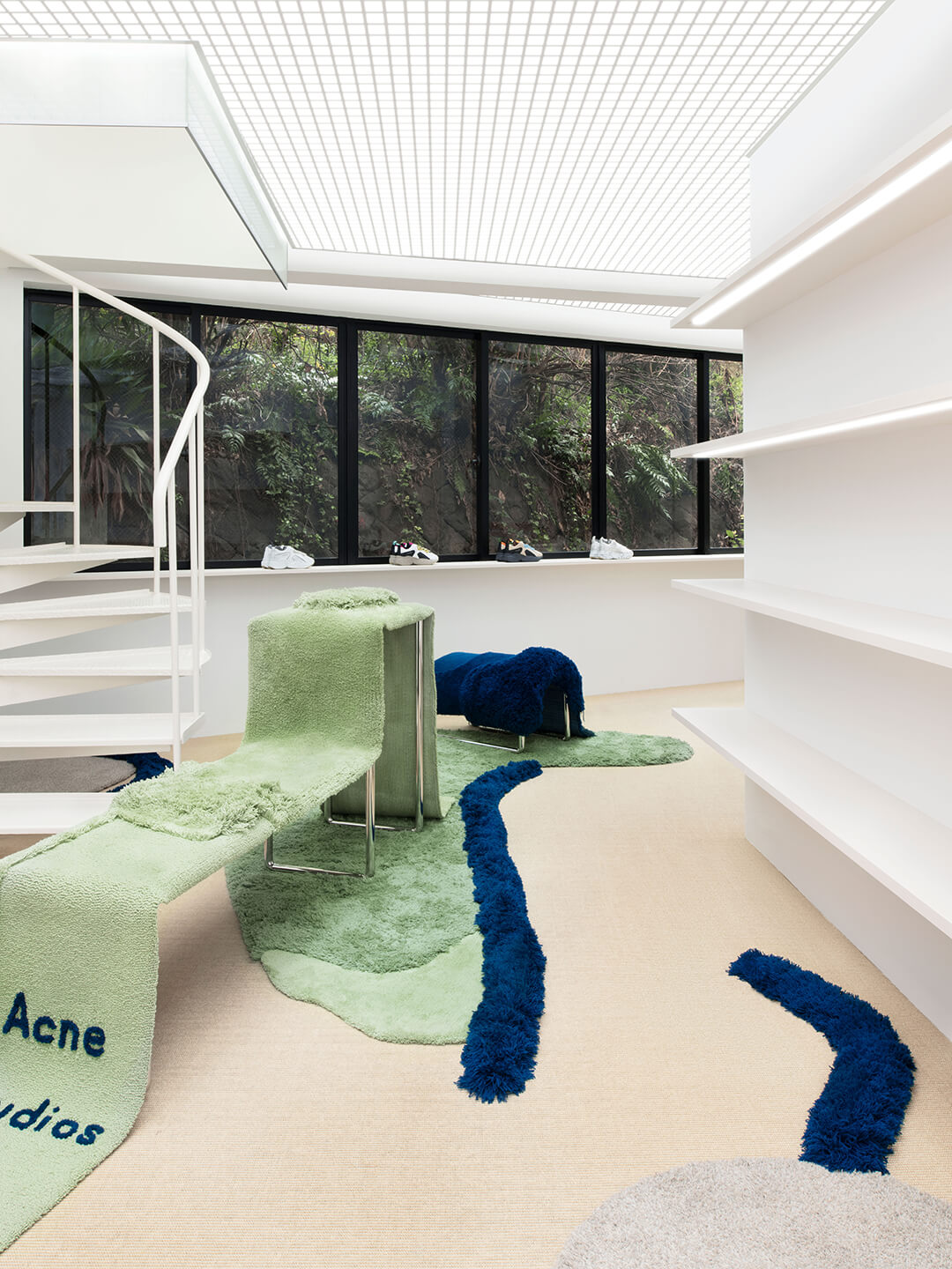
The sculptural environment is blended with organic structures, while the soft interior grants products instant spotlight. Today, shopper senses are by far too stimulated by various manipulations, disabling them to completely connect with the brand’s ethos. Acne Studio easily transmits the sense of calmness and an enjoyable atmosphere, fully delivering a healthy and memorable shopping experience.
Get inspired outside the retail industry
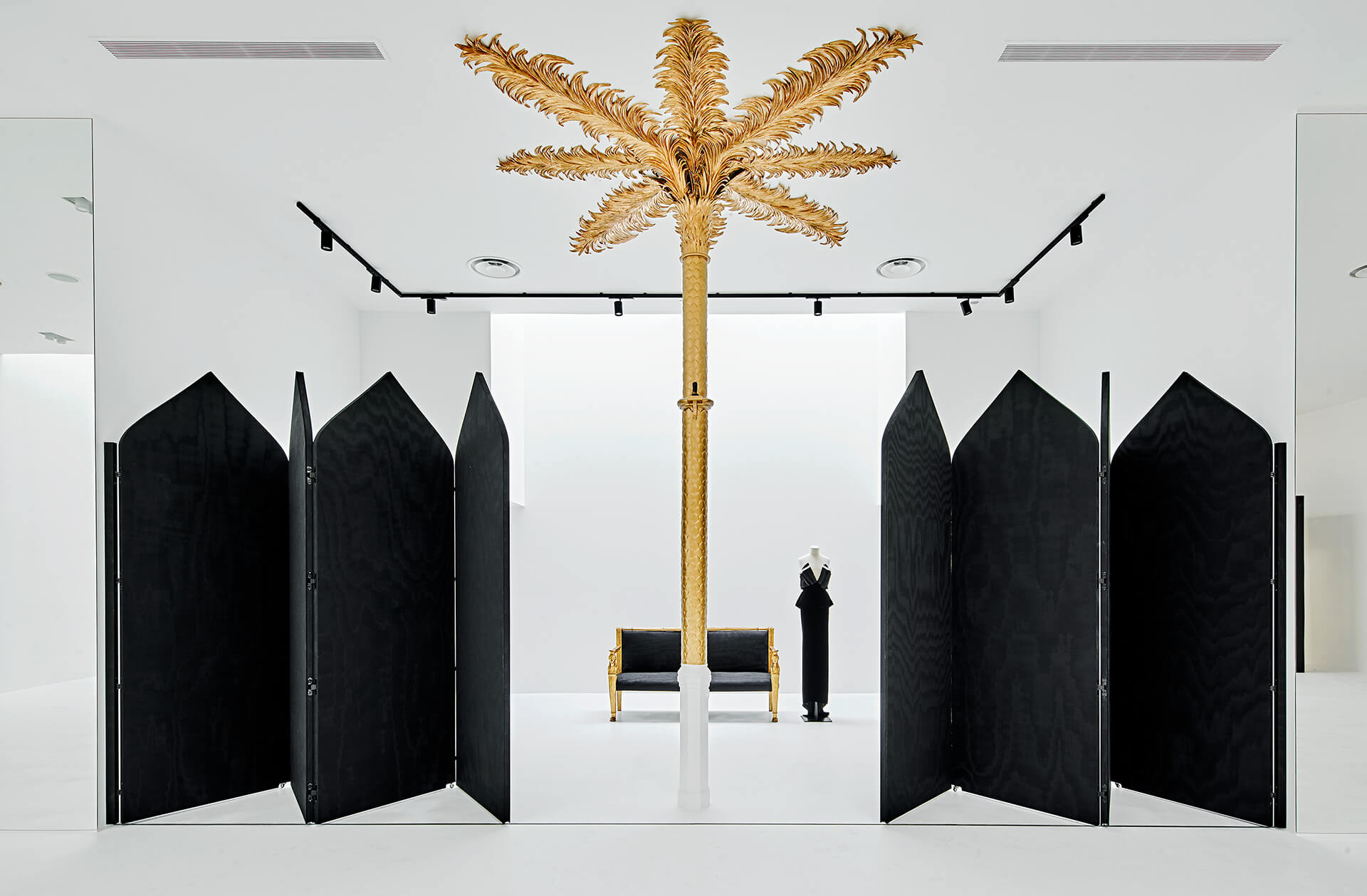
According to some of the most recent findings, the lockdown period may have altered our personalities. One of the principal findings was that since we got so used to being by ourselves or surrounded by a limited group of people, we might feel uncomfortable in very crowded spaces. With social distancing in mind, a trend that retailers can apply to make sure they grant the necessary space to their shoppers is shifting to the art gallery-like store design. This recent trend has many benefits, from providing a spacious area where people can freely walk around, to ensuring a unique experience.
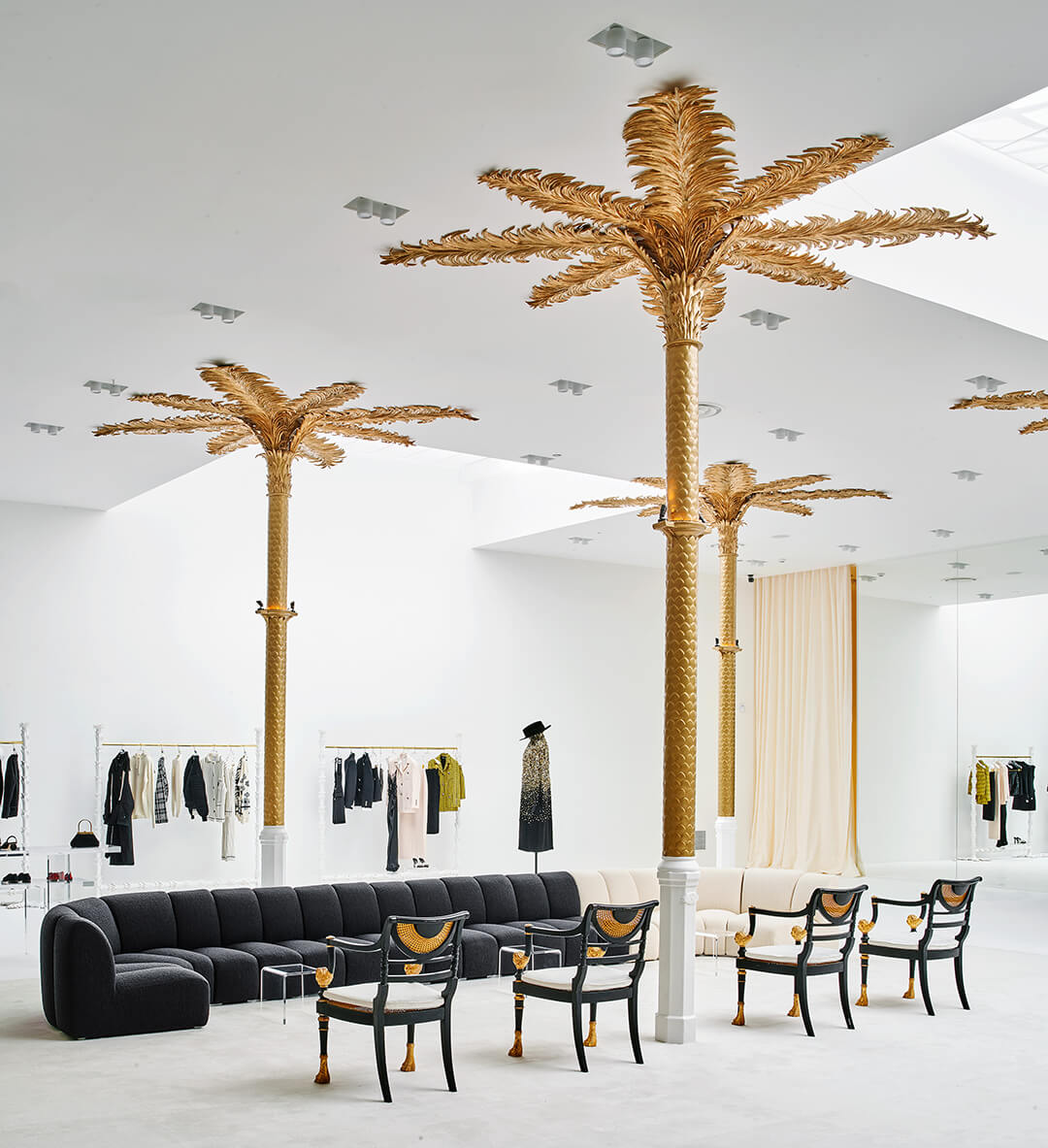
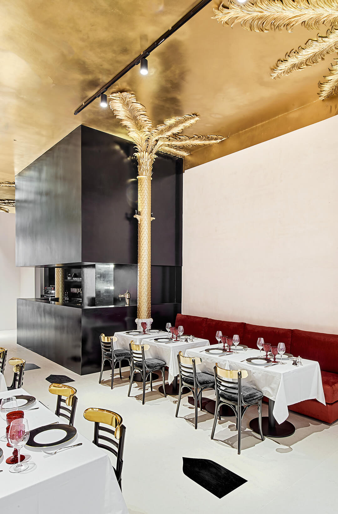
For their independent Barcelona store, the high-end brand Darial designed a unique experience with various services. The 1,500 sqm space hosts a clothing boutique, a bookstore, a gallery, and a restaurant. The store allows shoppers to browse around while delivering an unforgettable, miscellaneous experience.
Captivate new views - Filling Pieces
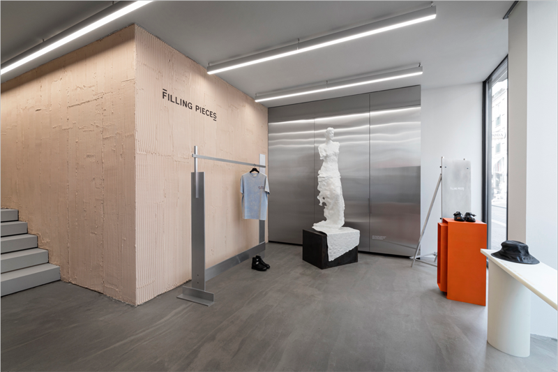
When it comes to blending retail and art, Amsterdam-based Filling Pieces remains a firm believer that physical shops are here to stay. With that in mind, they have recently opened their first flagship store in the fashionable Nine Streets district. Designed by art director Daniele Misso, the brand aims to develop into an artistic hub that will serve as a meeting spot for creatives. With art pieces and clothes shown alongside, the store currently serves as an exhibition space for a digital reproduction of Alexandros of Antioch’s sculpture Venus de Milo. For retailers, Filling Pieces can be a unique example of how to captivate new audiences that would generally identify with the brand and purchase the clothing style.
Go beyond selling clothes
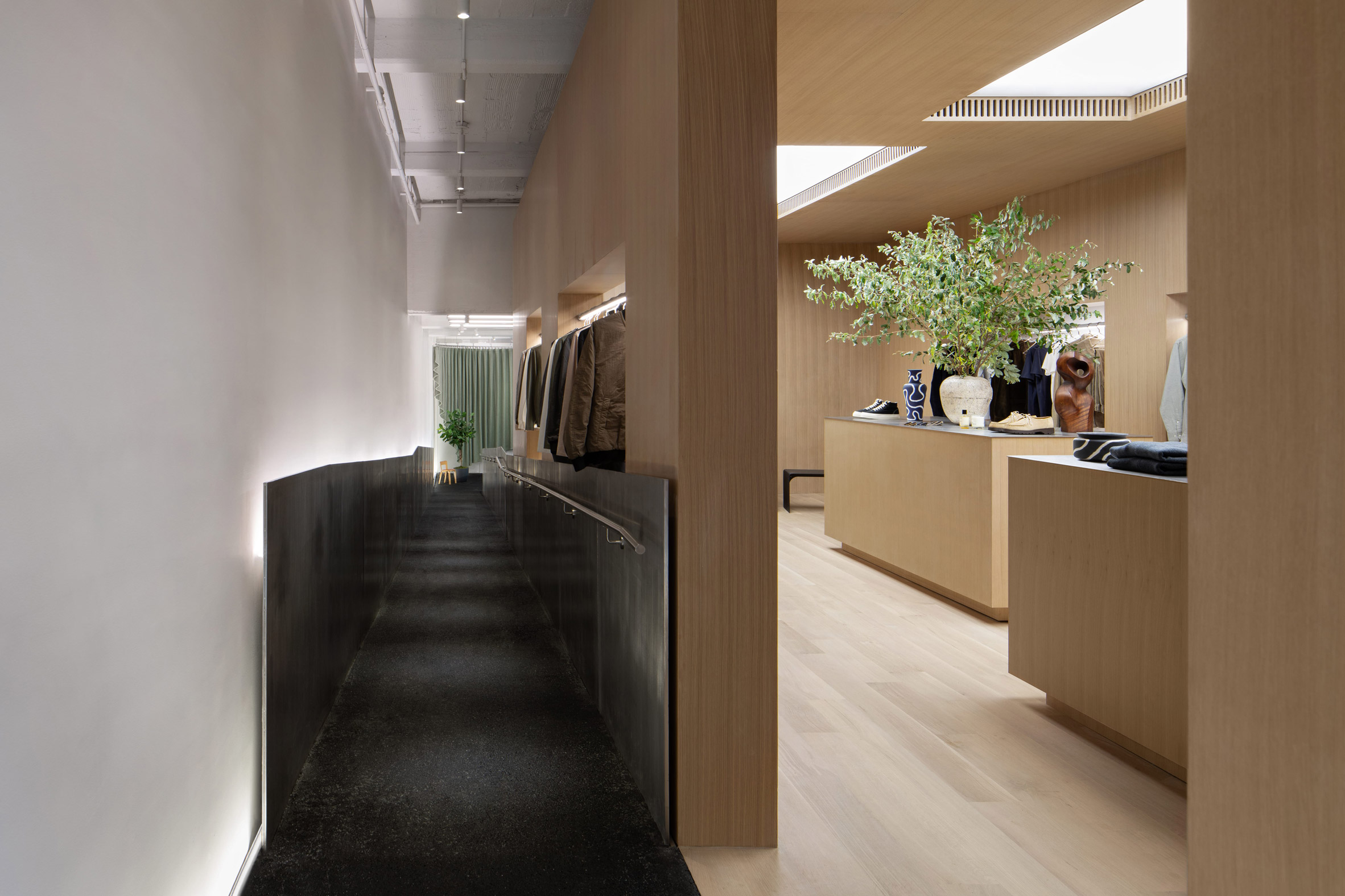
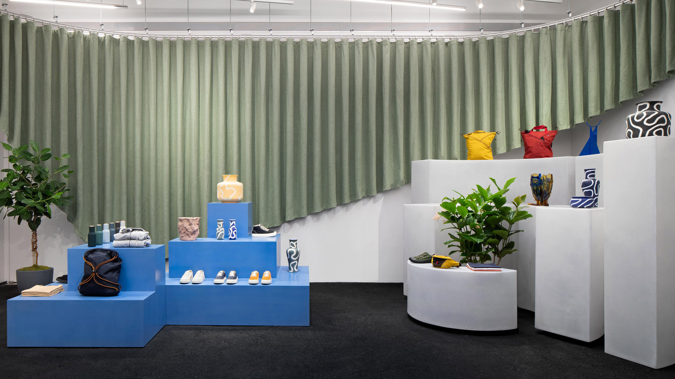
When we talk about delivering a memorable experience to your clientele in-store, this doesn’t necessarily limit it to a retail experience. As retailers struggle to increase foot traffic, repurposing their brick-and-mortars is a way of attracting more buzz. Retailers with vast physical stores can after a day of shopping repurpose their floor for events hosting. In this way, while visitors enjoy an event, they can also browse through clothes, increasing the brand’s awareness and potential sales. New York-based ONS Clothing Store is a great example of that. In collaboration with the architecture firm Collective, they have placed a stage with a green curtain for hosting gathering at the back of the store. The space will predominantly be utilized for cultural events and pop-ups, regularly bringing new visitors.
According to some recognized experts, the luxury industry is set to strongly rebound in the next year, with economic growth of 16.6 percent. This will require retailers to conduct an in-depth search in the preference of Millenials and Gen Z, as by 2026, they will account for 61 percent of the shoppers. One of their forecasts, when it comes to physical retail, is favoring multi-brand stores over brand outlets and department stores.
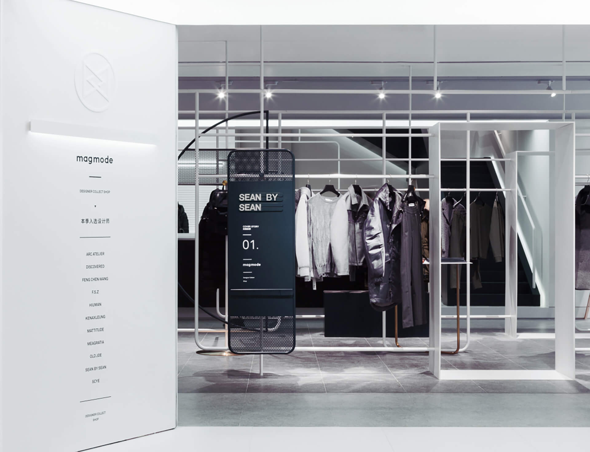
Although multi-brands offer creative freedom, the comprehensive range of products can create chaos, confuse visitors, and cause brand identity loss. How does one keep a multi-brand concept simple? Magmode, a Shanghai-based studio, has developed a unique, captivating solution by translating their physical store into a 3D magazine. To do so, they conveniently separated areas of the unique store to function as different pages of a print magazine. The shop’s signature was the ‘cover’ of the magazine, while their most recent collection was featured as the ‘first page’, right next to the cover. In this hip way, they simplified a multi-brand store concept, adding an exceptional touch of inventiveness.
With so many opportunities for unique visual merchandising within the store, it is a pity not to have more retailers experiment with creative layouts. As the need for one-of-a-kind, fresh store looks increases, we are anticipating the birth of remarkable brick-and-mortar concepts. On this note, we hope that this inspiring set of unprecedented examples can shake up, at least a bit, the snoozy retail industry and encourage traditional retailers to step out of their comfort zone.
Are you curious to learn more? Through our integrated decision-making platform at StoreDNA, we help you deliver dramatically improved performance through better product assortments, store layouts, visual merchandising, and associate optimization. Learn more here.